A beautiful opportunity to redesign the identity and digital platform for the Shirley Chisholm Education Foundation.
The foundation was shifting its focus to mentorship for young women of color and needed a brand update and fresh digital hub.
I started by working with a team to quickly ideate and produce various visual and conceptual directions for the SCEF brand. Our illustrator took the concepts to build the final brand mark, seen at right.
As the art director on this project I provided both initial concept work, guidance and an eye over the final deliverable.
Creative Director: Simona Ternblom
Graphic Designer and Illustrator: Michael McQuade
Discovery Work
Knowing that the image of Shirley’s face was key to the brand we explored a wide range of visual styles including minimal line art, stamps and seals. Our illustrator ended up creating the final look inspired by vintage campaign posters and printing methods. Below are three style tiles exploring various visual options.
Style Tile 1: Bold Colors and strong shapes, chosen direction
Style Tile 2: Playful shapes and youthful colors
Style Tile 3: Natural shapes and line explorations
A Strong Identity
We worked closely with the client to perfect the brand mark, taking into considerations all of the little aspects that define Shirley’s face and make it recognizable. There were various glasses explorations: cat eye or square? As well as many conversations around getting her hair and brow line just right.
In the end, we landed on a strong mark focused on Shirley that is accompanied by a wordmark. In order to provide scale we delivered the logo in various formats that are dependent on size and media.
A Design Library
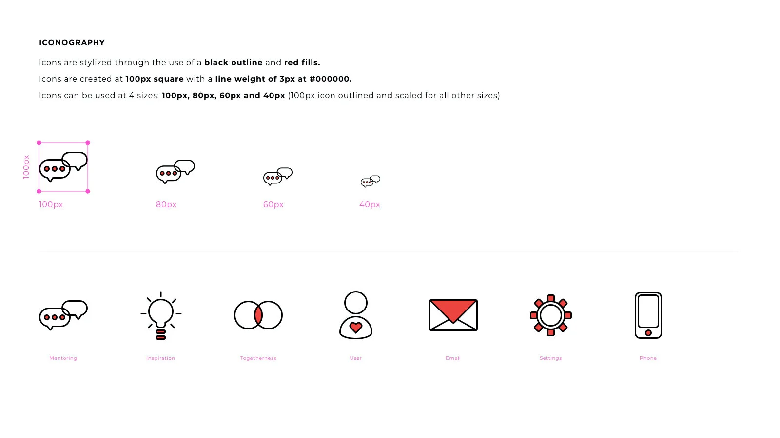
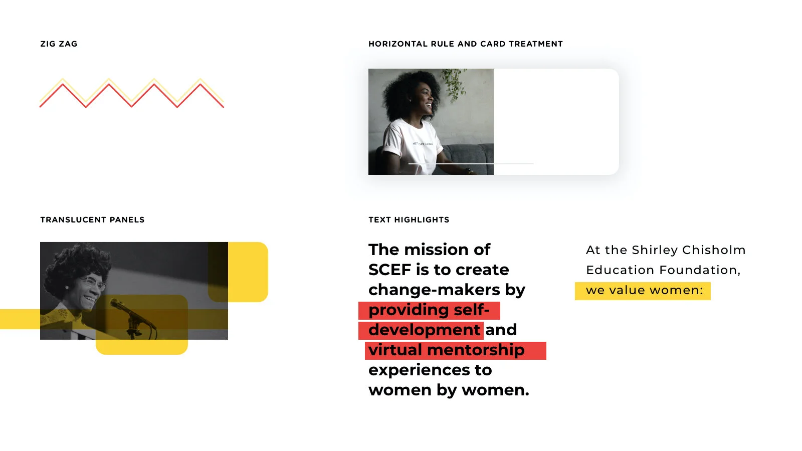
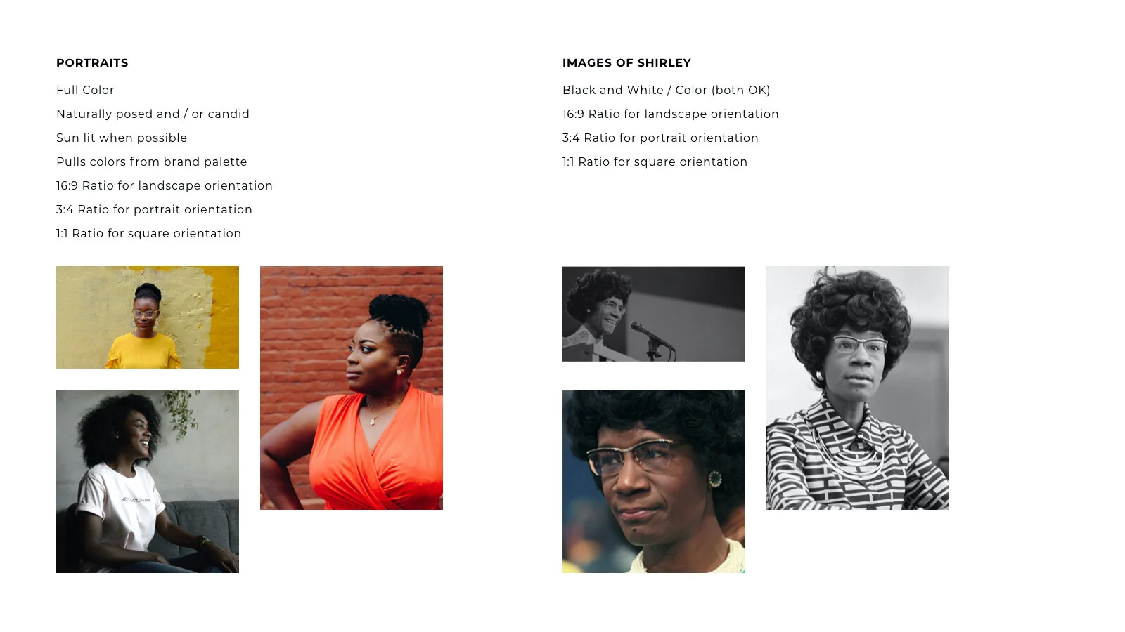
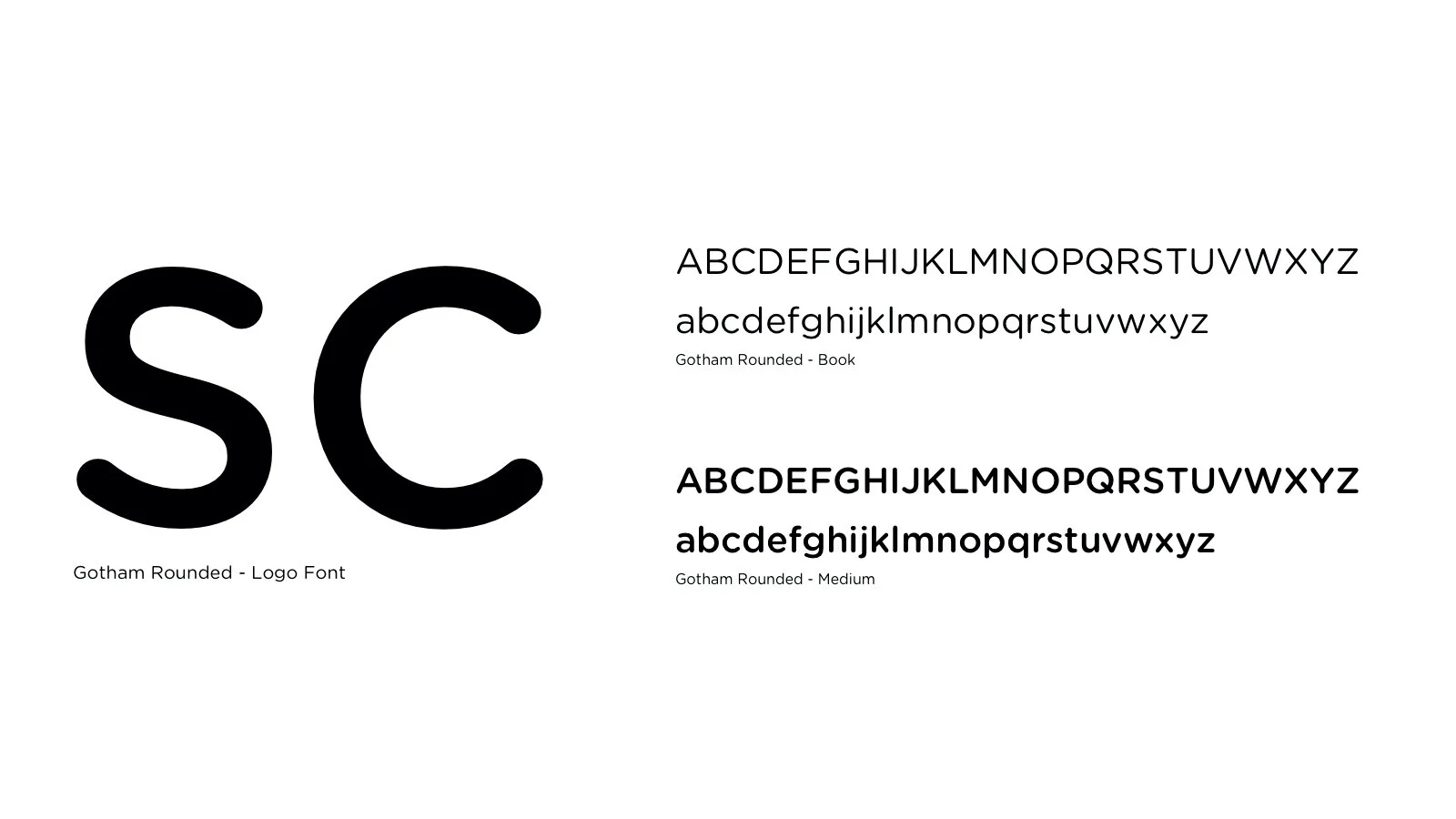
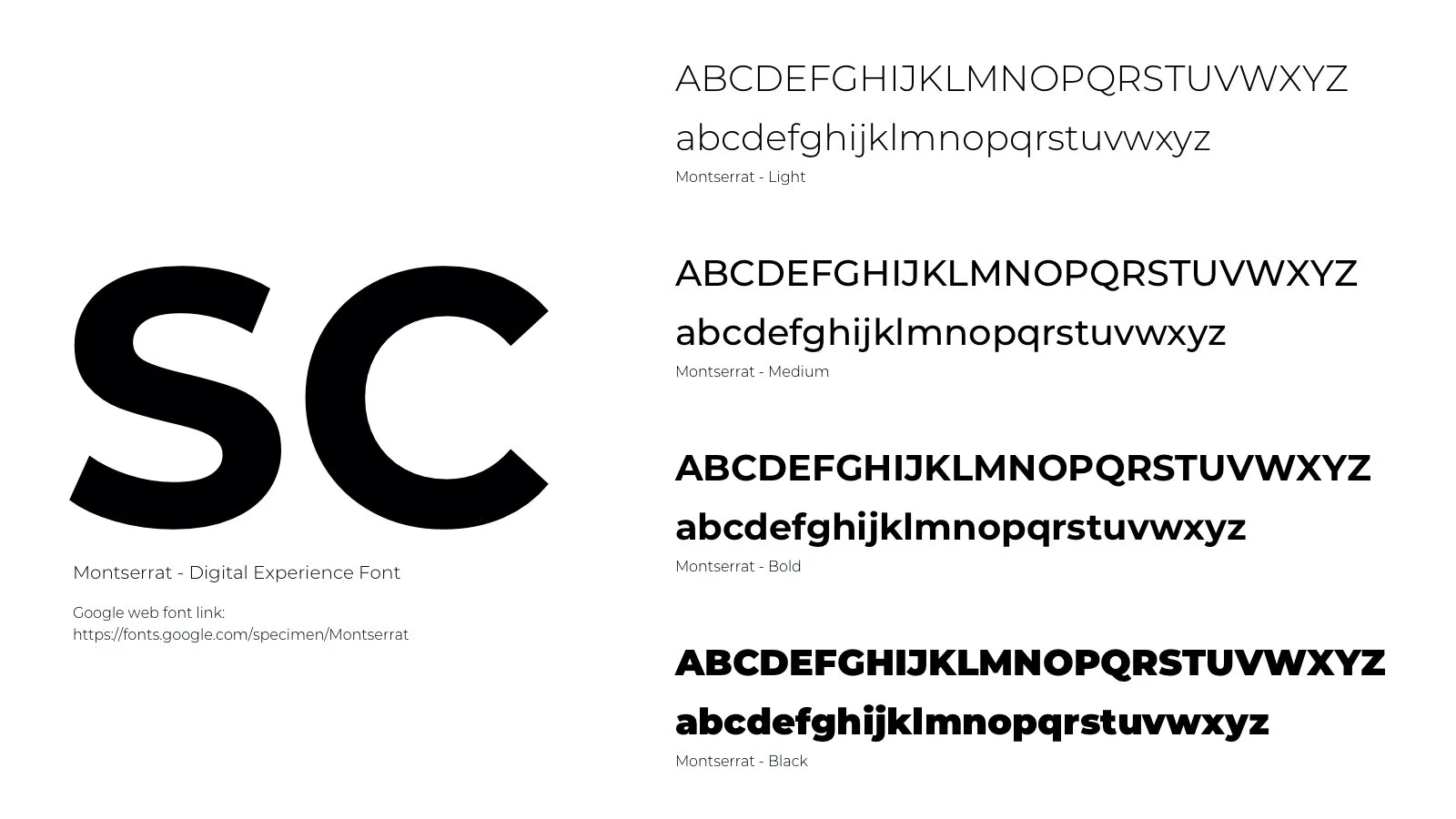
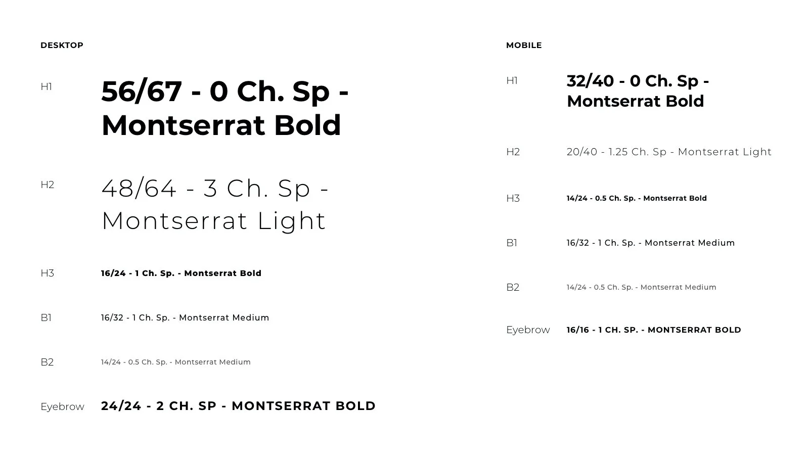
A cohesive set of flexible components, textures and visual treatments provided a foundation for the entire experience to be developed with ease.


Digital Experience
Concept pages to direct a development team in the construction of a cohesive online experience.


Real World Extensions
The brand was thrilled with being able to put their brand and message out into the world through customized items including t-shirts, notebooks and stationery.
